
Follow
The coffee on the left is lighter than the coffee on the right. The coffee on the bottom is the ground version of the coffee on the top (with greater difference for lighter coffees than for darker coffees)
@gnomon It's a thread.

@neal I saw the root of the thread but couldn't figure out how your description applied to it!
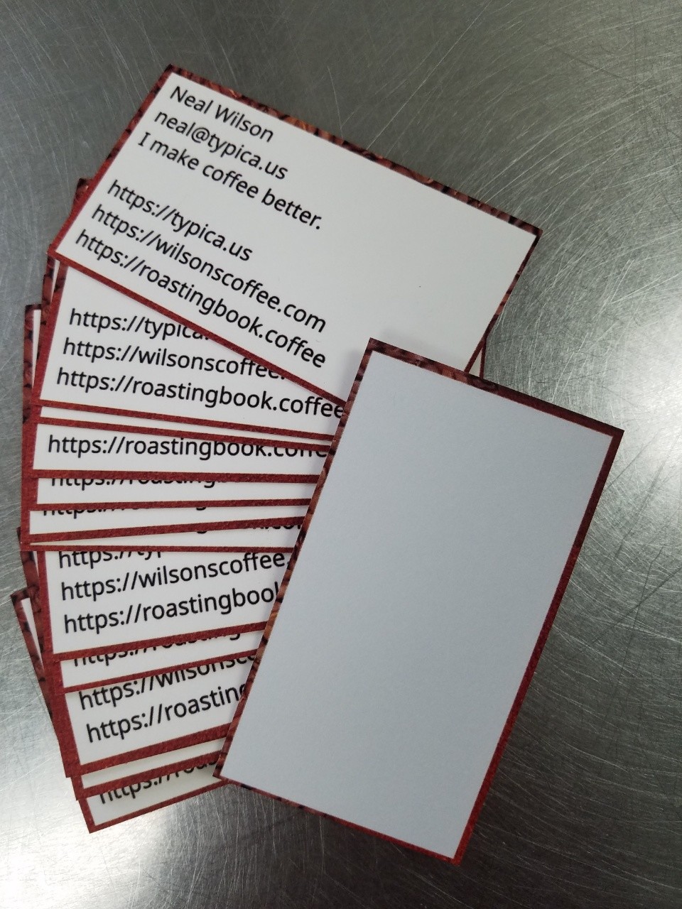
But your reply confirmed it was intentional, so I went back and zoomed in and saw the edging image and now I get it. (When I saw it this morning the lighting I was under made it look like one solid color.)
Sorry about that. Thanks for the explanation!
@gnomon It's subtle. Easy to miss.

@neal er?