Follow

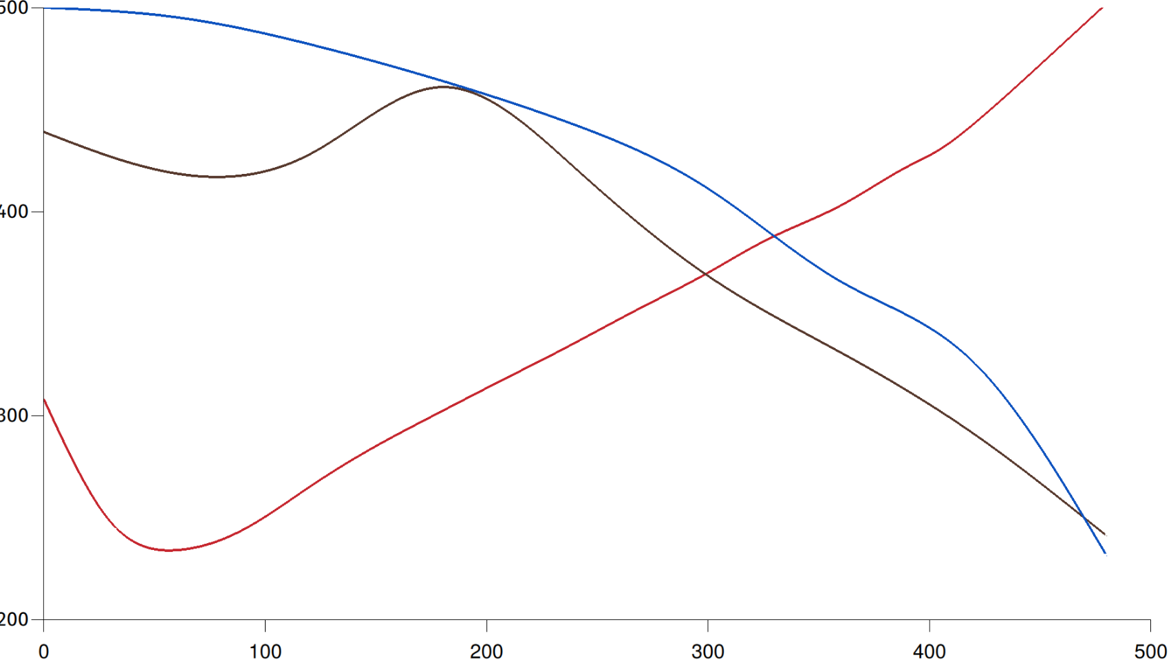
Graph in progress. The red line shows temperature over time for a ridiculous super dark 8 minute roast. The brown line doesn't have an axis but it's showing degree of roast over time for that same coffee. The peak in the middle (blanch point) marks the start of chemical changes significant to the finished cup. The blue line (axis also missing) shows mass over time for the same batch. 1st and 2nd cracks are highly visible if you look at the inverse of the rate of change of mass.