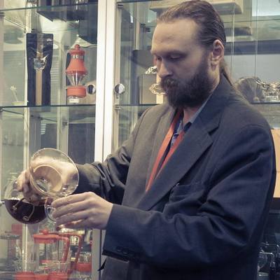
Neal Wilson ✅ @neal@social.typica.us
- Software
- https://typica.us
- Send Money
- https://typica.us/payment.html
Admin
Author of Typica software for coffee roasters.
Joined Apr 2018
What if Prolog and Smalltalk had a baby?
My sister has switched to the grey sheets in preparation for my cat staying with her while I'm out of town.
My car passed emissions tests.
After spending so long working on top of abstraction layers, it's nice to have a no priority side project where I can drop down to bare metal again.
Remember the preview for that promo video for my shop that I posted a few weeks ago? (Of course not, it only has 3 views on PeerTube) I got the full version yesterday and finally got around to watching it today. There are a couple points that I cringe at but overall I think it turned out really nice. https://video.typica.us/videos/watch/1f12990f-df8a-4e28-b77a-0d93b607f3af
Flash roasts and slow roasts done outside on a pan over a low flame probably deviate from the linear model, but the data points that I have are all so close to the regression that variation can be explained entirely by the limits of precision that I had to work with.
Today I finished making the last of the tweaks for my presentation aside from the sponsor slides where I'm going to wait as long as I can for logo files. The last graph that I wanted to add in this time around shows pleasantly tight data around a regression line showing how coffee mass at blanch point changes depending on how long it takes to get there (3 to 7.5ish minutes: that covers the vast majority of production roasts of specialty coffee).
My cat is like Clippy. "I see you're trying to eat breakfast. Would you like to pet the cat?"
The shortcut to success. Also, I like Shallotte's hat. My winter hat is similar. #AtelierSeries
It's 2:40AM. Time to hug the cat, local cat says.
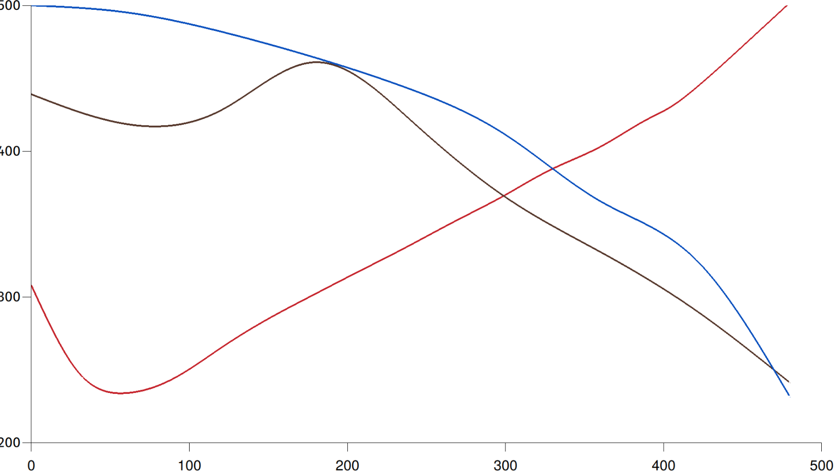
The really neat thing about that mass rate curve is that you can see as first crack is finishing, the rate of mass loss settles back down to where a linear progression from pre-1C would have been (until 2C kicks in and pushes mass loss rate back up again).
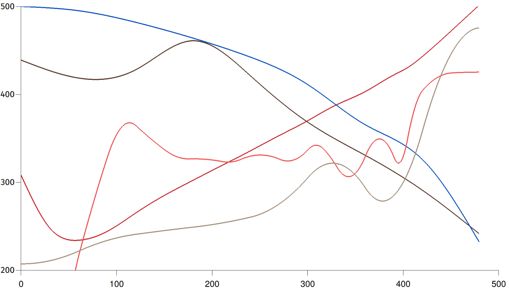
Rate of temperature change and inverse rate of mass change overlaid. This combination of measurements gives you a strong visual indication of blanch point, first crack, and second crack even if you have no idea how my machine calibrates compared with yours. It's also a mess.
Neal Wilson ✅
boosted

Graph in progress. The red line shows temperature over time for a ridiculous super dark 8 minute roast. The brown line doesn't have an axis but it's showing degree of roast over time for that same coffee. The peak in the middle (blanch point) marks the start of chemical changes significant to the finished cup. The blue line (axis also missing) shows mass over time for the same batch. 1st and 2nd cracks are highly visible if you look at the inverse of the rate of change of mass.
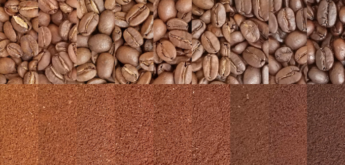
Production test batch of the next Ethiopian coffee turned out great. It's classic Yirgacheffe.
- Software
- https://typica.us
- Send Money
- https://typica.us/payment.html
Admin
Author of Typica software for coffee roasters.
Joined Apr 2018