
Neal Wilson ✅ @neal@social.typica.us
- Software
- https://typica.us
- Send Money
- https://typica.us/payment.html
Admin
Author of Typica software for coffee roasters.
Joined Apr 2018
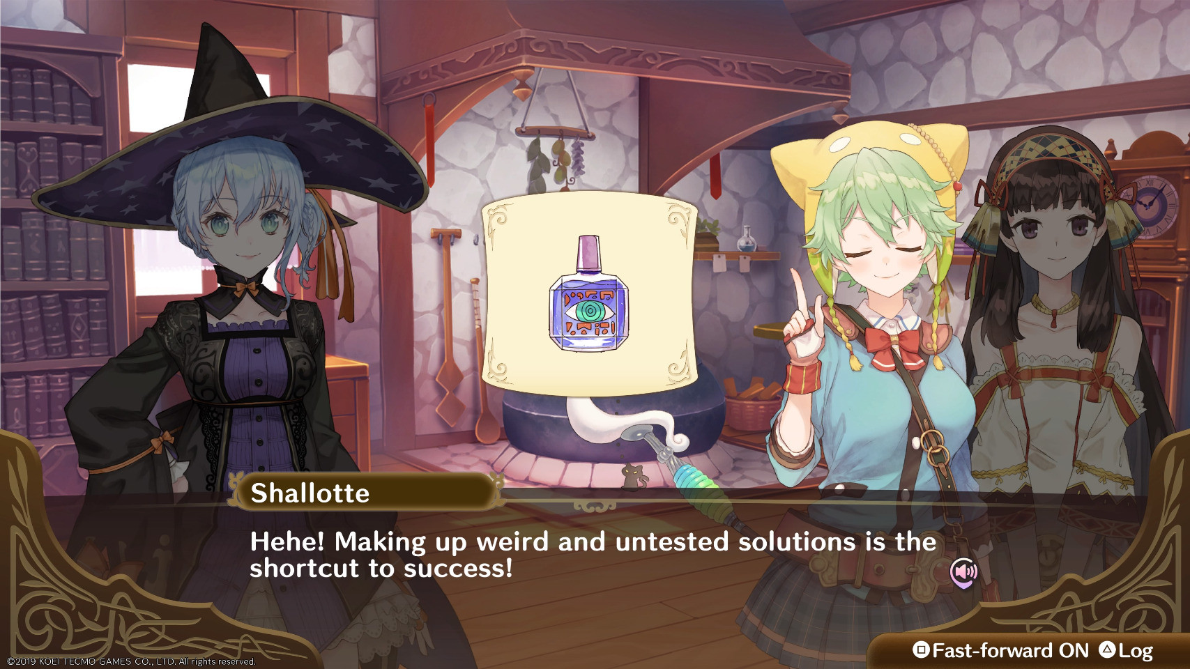
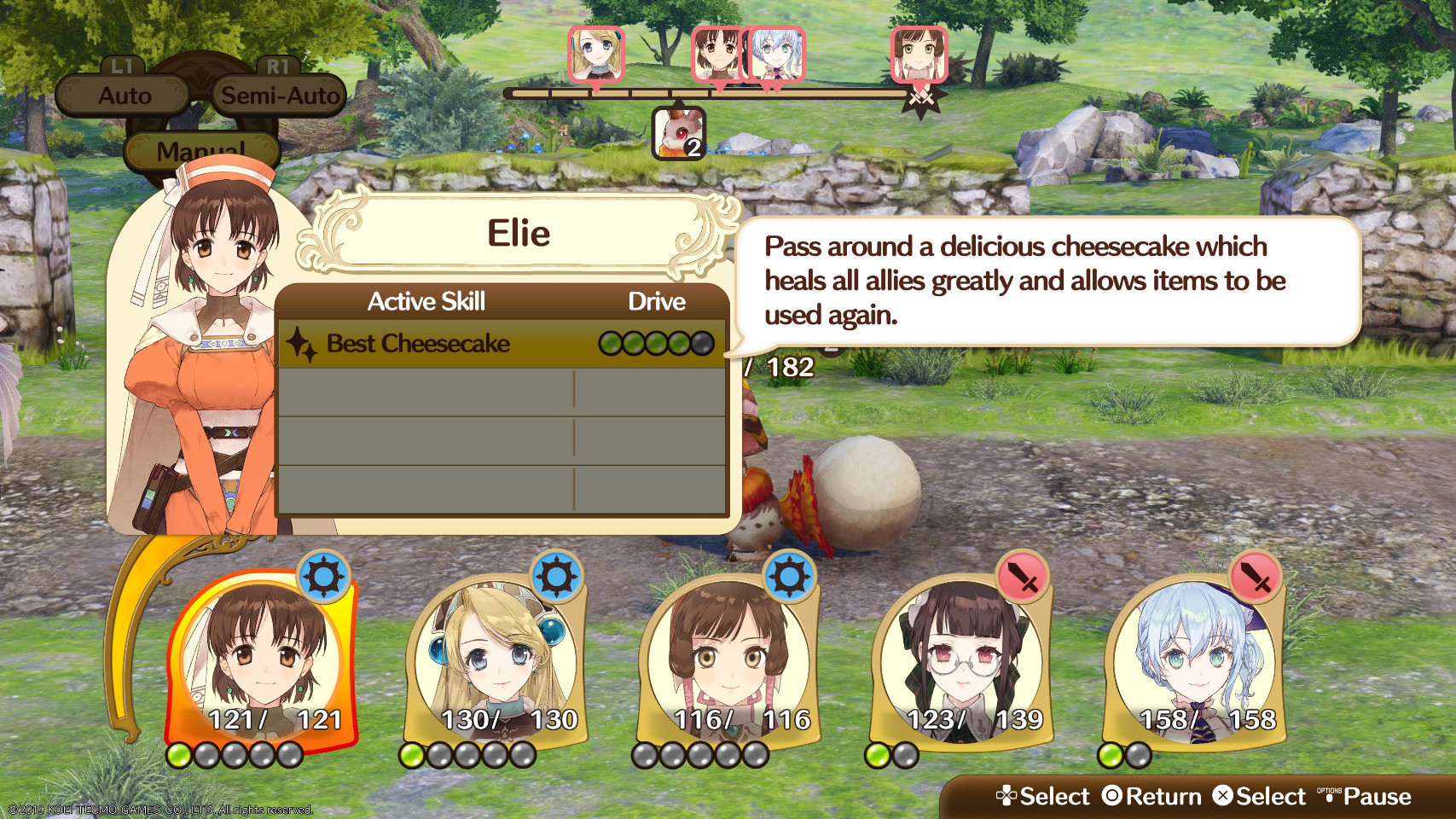
The shortcut to success. Also, I like Shallotte's hat. My winter hat is similar. #AtelierSeries
It's 2:40AM. Time to hug the cat, local cat says.
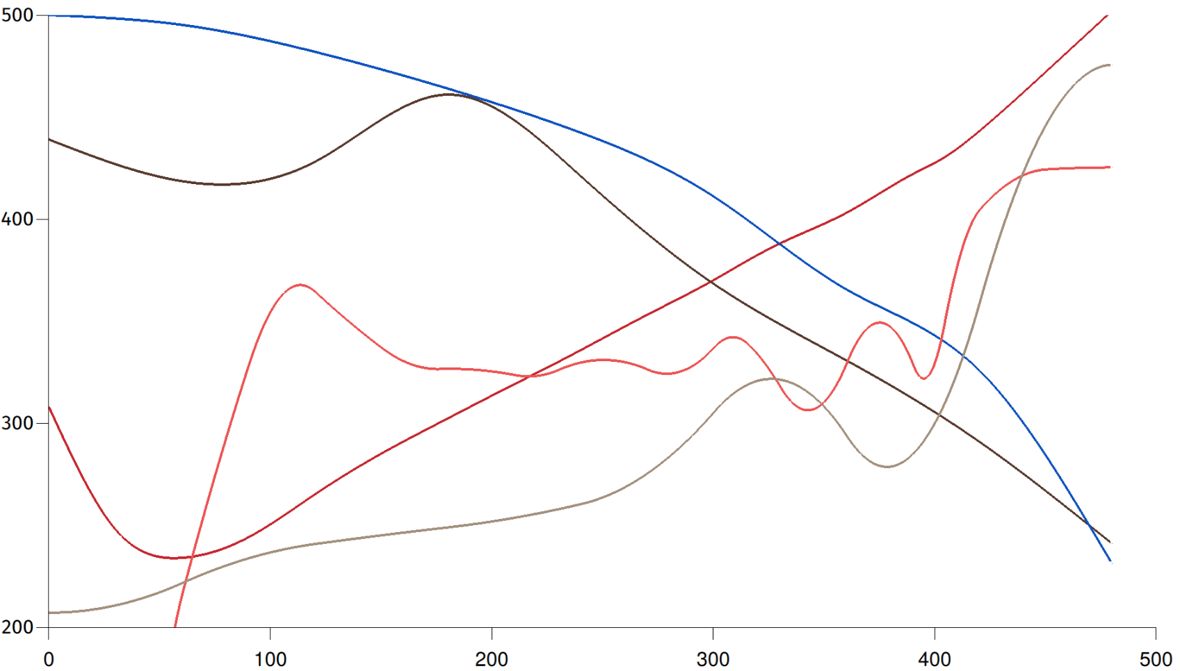
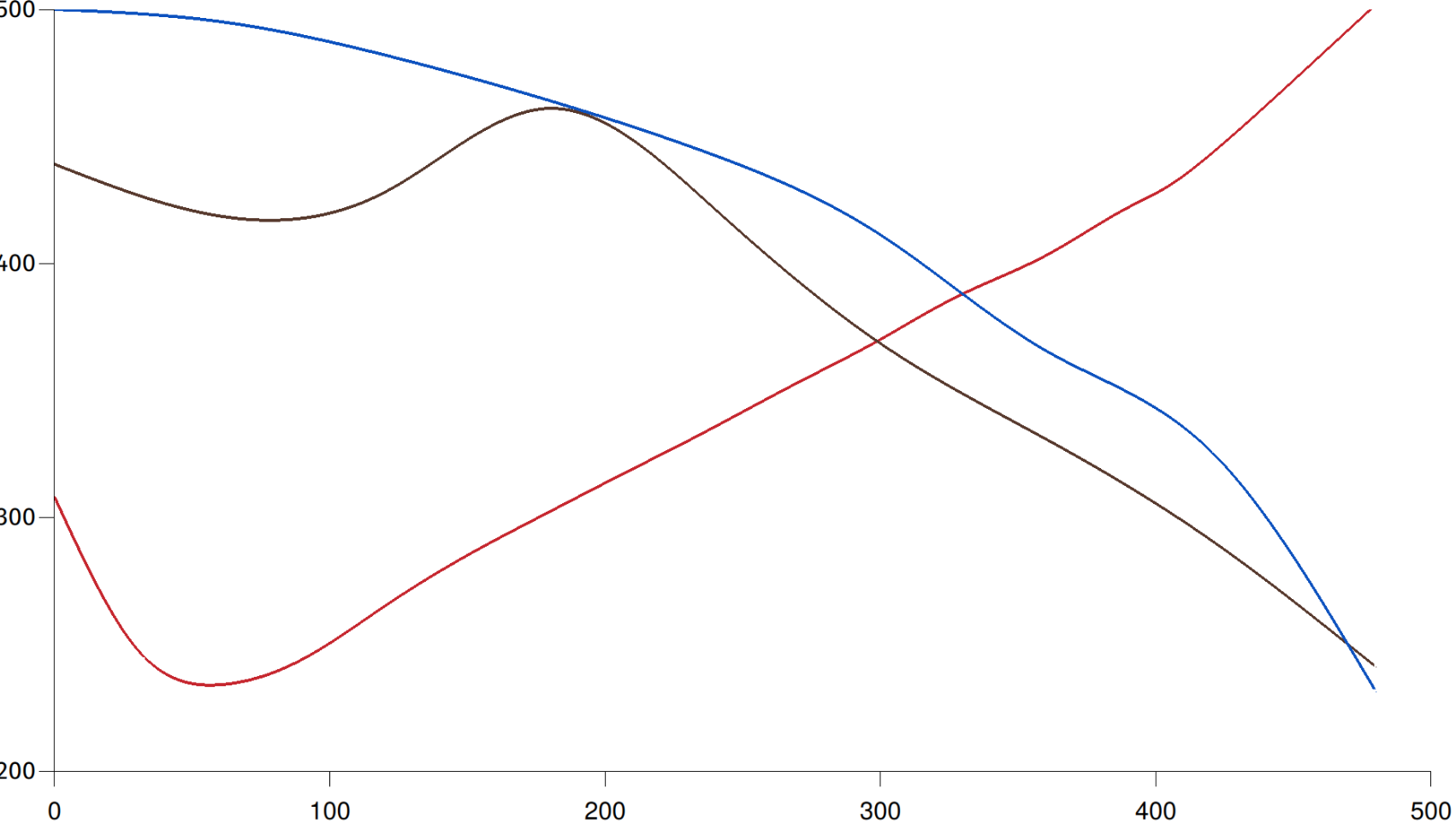
The really neat thing about that mass rate curve is that you can see as first crack is finishing, the rate of mass loss settles back down to where a linear progression from pre-1C would have been (until 2C kicks in and pushes mass loss rate back up again).
Rate of temperature change and inverse rate of mass change overlaid. This combination of measurements gives you a strong visual indication of blanch point, first crack, and second crack even if you have no idea how my machine calibrates compared with yours. It's also a mess.
Neal Wilson ✅
boosted

Graph in progress. The red line shows temperature over time for a ridiculous super dark 8 minute roast. The brown line doesn't have an axis but it's showing degree of roast over time for that same coffee. The peak in the middle (blanch point) marks the start of chemical changes significant to the finished cup. The blue line (axis also missing) shows mass over time for the same batch. 1st and 2nd cracks are highly visible if you look at the inverse of the rate of change of mass.
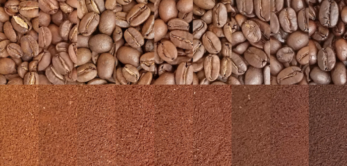
Production test batch of the next Ethiopian coffee turned out great. It's classic Yirgacheffe.
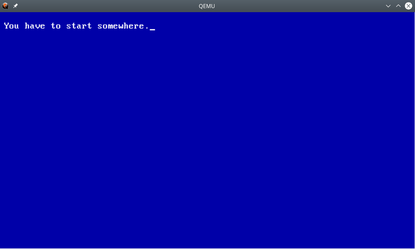
Oh dear $DEITY, I've gone ahead and installed nasm and qemu over lunch.
I've got some plane rides coming up soon. Maybe I'll see if I can hack out anything interesting then just to see if any major problems show up.
I just very briefly considered writing a new research OS. It's such a bad idea, but I'm going to make a note of the core design concepts anyway in the event that I ever take a sabbatical.
I think the cat has figured out that I'm going on a trip again soon. I still need to buy supplies so my sister doesn't have to buy cat stuff while she's taking care of the cat for me. I'm also in the awkward time where I don't want to buy groceries but I also don't have quite the right foods.
Now that I've played Nelke & the Legendary Alchemists for a little while I think it's safe to say that while a lot of early titles are Gantt Chart: The Game, this one is Supply Chain Management: The Game.
Neal Wilson ✅
boosted
Bought a mechanical keyboard with more resistance so my code will be strongly typed.
Neal Wilson ✅
boosted

birdsite: look, you can set colors and headers on your profile
users: boring, give us something more
pleroma: ok
users: wait fuck, not that many settings
firefox_2019-04-04_09-18-58.png…
firefox_2019-04-04_09-19-11.png…
firefox_2019-04-04_09-22-35.png…
firefox_2019-04-04_09-22-50.png…
users: boring, give us something more
pleroma: ok
users: wait fuck, not that many settings
firefox_2019-04-04_09-18-58.png…
firefox_2019-04-04_09-19-11.png…
firefox_2019-04-04_09-22-35.png…
firefox_2019-04-04_09-22-50.png…
- Software
- https://typica.us
- Send Money
- https://typica.us/payment.html
Admin
Author of Typica software for coffee roasters.
Joined Apr 2018